The Perceived Risk of Nuclear Power
Does risk play a factor in the housing market? Obviously it does—if it didn’t, Detroit wouldn’t be in trouble right now, prices in high-crime areas would be the same as everywhere else, and we’d have subdivisions built on top of active volcanoes (at least in places other than Hawaii). But does perceived risk have an impact on housing prices? Obviously not in every case—if it happened all the time, California’s earthquake risks would result in a very empty state, or very low housing prices—but what about with something that is generally perceived by the public as unsafe, despite a pretty good safety record? For example, what about with nuclear reactors?
I chose this topic because I’ve had an interest in nuclear development and nuclear power for many years, and I already had a decent grounding in the history and background. In addition, nuclear power is often portrayed by the media and Hollywood as unsafe, despite a stellar safety record in the United States, making it an ideal candidate to see if perceived risk could influence housing prices. This was something that I’d been wondering about since starting my economics degree, so I was thrilled by the fantastic opportunity to actually research this by mapping data and analyzing the results.
I began with some basic research on whether housing prices could be affected by risk. One paper I found, Does a Property-Specific Environmental Health Risk Create a “Neighborhood” Housing Price Stigma? Arsenic in Private Well Water, written by Kevin Boyle, Nicolai Kuminoff, Congwen Zhang, Michael Devanney, and Kathleen Bell, studied the impact of arsenic in the well water of two towns in Maine. They found that housing prices had been significantly depressed after the discovery of arsenic, though the effect lasted a mere two years. They contrasted that with numerous other studies that focused on Superfund cleanup, where the effects of contamination on housing prices could lower housing prices in the surrounding areas for decades following the successful cleanup of a site (Boyle et al.).
Two other excellent papers that discussed the reduction of property values were Estimates of the Impact of Crime Rates on Property Values from Megan’s Laws (Linden and Rockoff), which discussed the effect registered sex offenders have on local property values, and Estimation of Perceived Risk and its Effects on Property Values (McCluskey and Rauser), which concludes that both media coverage and past perception of risk influence current risk perception—and that increased perception of risk lowers property prices.
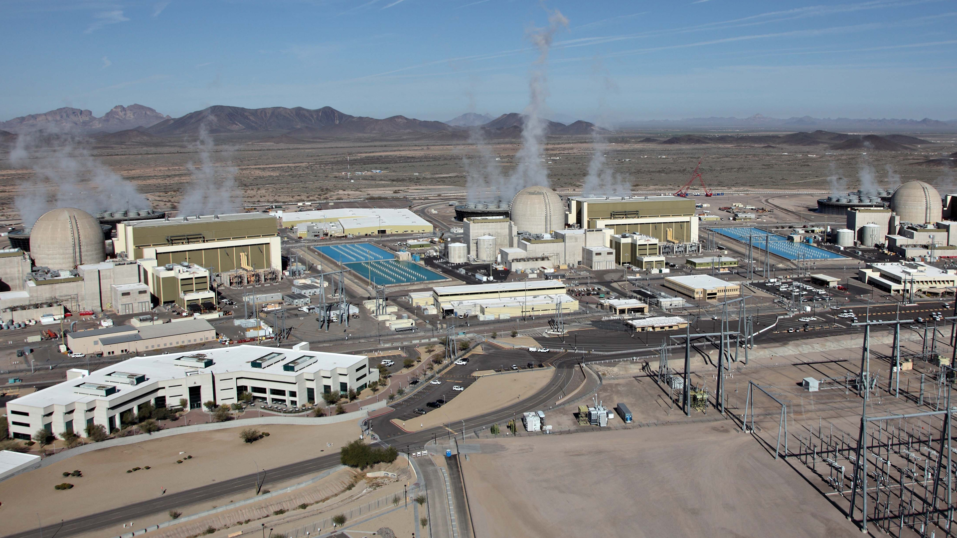
When I walked away from my research, I was far more confident in my ability to draw some conclusions based on what the data said—people were just as influenced by perceived risk as they were by actual risk. But where would I 1) be able to find a reactor in a fairly risk-free area (or at least one perceived as being risk-free), and 2) be able to find the data I would need? After doing some searching, I decided to use the Palo Verde Nuclear Generating Station, for several reasons. Firstly, because it is in a fairly stable area—the Phoenix, AZ. area isn’t prone to violent weather, flooding, earthquakes, or any other sort of natural phenomenon that might influence perceived risk (they do have some water issues, but I assumed for the sake of this project that people don’t take longer-term risks into account when deciding where to live). Phoenix is regarded by many as a generally pleasant place to live, though perhaps a touch on the warm side. Secondly, because the Palo Verde NGS[1]Unless otherwise noted, Palo Verde Nuclear Generating Station, Palo Verde NGS, and PVNGS all refer to the same thing, which is the plant. “Palo Verde”, used by itself, refers to the nearby town. is the largest nuclear generating station in the United States—if people are concerned about living next to a nuclear generating station, they’d likely be most concerned about living next door to the largest NGS in the United States. And thirdly, I chose PVNGS for a much more personal reason: I’m originally from Phoenix, and I seize any opportunity to look at anything in the Phoenix area… especially during a chilly St Louis spring.

I also decided to focus my research within a ten mile buffer zone of PVNGS; nuclear plants such as the one at Palo Verde are required to have a ten-mile evacuation zone around them. Within this zone, warning sirens are tested regularly, radiation monitoring is conducted, and instructions for evacuation are distributed regularly. I assumed that this ten-mile zone would be where the dangers of the generating station would be most emphasized, and therefore where the largest effects on housing prices would be.
After I figured out what I was doing and where I’d be doing my analysis, I started looking for sources of data. I’d decided to look at both housing prices, and at household income. I found that Esri’s ArcGIS Online community had both in prepackaged datasets; unfortunately, they didn’t appear to allow me to view their underlying data, which made them useless for calculating population and estimating both housing prices and household income in a particular area. Since the easiest way to get my data (using Esri to do it for me) was out, I turned to the Census Bureau. I was focusing on housing prices and on household income, so I picked the American Community Survey as the best source of data that encompassed both, and I chose to use 2011 data because the 2012 data didn’t want to import into ArcMap properly on my computer.

In order to properly compare housing prices and income, I would need to have a community that was roughly comparable to the area around PVNGS, while being far enough away that it wouldn’t be influenced in any way by the nuclear plant. After looking at most of the small communities in Arizona that were between 40 and 60 miles from downtown Phoenix (Palo Verde NGS is approximately 50 miles from downtown Phoenix), I selected Coolidge, AZ., as my control community. It had roughly the same demographics, approximately the same population, and was located well away from PVNGS.
Next up was figuring out how many people lived near Palo Verde NGS, so I could double-check against the population numbers I had for Coolidge. This was originally a challenge, mostly because I wanted a fairly accurate number from what are essentially giant tracts of Census data (for the area I was in, the Census data was limited to tracts [or at least that was all I could find]). I checked to see if anyone else had had this issue before me, and I was rather surprised to learn that MSNBC investigative reporter Bill Dedman had written a very interesting analysis called Nuclear Neighbors: Population Rises Near U.S. Reactors, which included an analysis of population growth near nuclear power plants between 2000 and 2010. While the results weren’t directly applicable to my project, since the data was from a different year than what I was working with and involved different variables, a paragraph at the bottom of the article was: it noted that, because the population data was contained in census tracts, the data had been averaged based on how much of the tract was included in the buffer. A little more searching led me to instructions from Esri on how to do the same thing for the dataset I was using, and for the household income and housing prices values.

Of course, this also presented a challenge in how to interpret this averaged data. Ultimately, issues with the data I had averaged led me to drop household income from my dataset—the numbers I was getting for average household income were simply too low. It’s completely possible that the average household in some areas only makes $3 per year, but Occam’s Razor would suggest that I was experiencing errors with my data instead. I had hoped that I would be able to go back, figure out my error, and obtain the correct data, but I simply didn’t have enough time to do so. This is more than a little unfortunate, because I believe that household income data is tied closely to housing prices. Leaving income out of the analysis only paints part of the picture.
This actually brings up a very important point about the rest of my analysis; while the numbers I received for housing prices are quite reasonable, and the numbers I had from Coolidge were quite close to the numbers I found on the Census website, they are estimates based on how much property is near the plant, and assumes that every tract has a single average value. A manual review of the data shows property values that are quite sane, taking into account the terrain and population of the area, but it must be remembered that they are estimates based off of estimated data (since the ACS only surveys a fraction of the residences in an area, and uses their surveys to estimate values for the entire area). Unfortunately, without GIS data from the Maricopa County Assessor’s Office (which proved too cost-prohibitive to acquire), there’s was no method I could find that would have resulted in a better estimate.
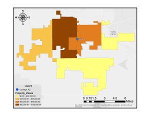
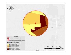
Keeping all of the above caveats in mind, along with the fact that my sample size for this survey was one nuclear power plant and one control city, I can tentatively conclude that housing prices near nuclear reactors are lower than housing prices in comparable communities. This doesn’t really surprise me—my research into the history and development of nuclear power shows that the “not in my backyard” mentality (known by the fairly catchy acronym NIMBY) is extremely pronounced when it comes to the construction and operation of nuclear reactors—though I am surprised that it was as pronounced as it is. According to my data, median housing prices around Palo Verde NGS are around $13,000 lower than the median housing prices in Coolidge– $48,232 versus $61,285. I was expecting a gap of ~$5,000, not a gap of almost three times my estimate.
And given the expansion of Phoenix in the past ten to fifteen years, I conclude that prices were originally even lower and have been artificially inflated due to housing pressures; the nearby city of Buckeye, located about fifteen miles to the west, grew from a population of 6,537 in 2000 to 50,876 in 2010—a 678.3% increase in ten years. The associated housing shortage could have easily raised housing prices in the area by a significant amount, though I don’t have the required data to estimate by how much.
Unfortunately, I wasn’t able to perform the analysis I really wanted to perform. When I set out on this project, I had intended to show that the Palo Verde Nuclear Generating Station had depressed prices in the immediate area surrounding it, which, due to limitations of my data, I was unable to prove. I had intended to use Census data from the 1970, 1980, 1990, 2000, and 2010 Decennial Censuses, but unfortunately they either didn’t record the data I needed, or they were unavailable. I tried using the historical data from NHGIS, but I was unable to make it work the way I needed it to.
So, in the absence of the data that I couldn’t obtain, how could I have expanded this to increase the accuracy of my conclusions? It probably wouldn’t have been incredibly difficult to expand this to other nuclear generating stations in the United States (and, given enough of a break from school and work, I would love to do this). If I could show that the same effect was present near other nuclear plants, it would vastly increase the plausibility of my evidence. And controlling of local risk factors would probably be fairly straightforward as long as I was careful in my choice of control community.
In addition, getting the proper household income data would paint a much clearer picture of what is going on—knowing that housing prices are lower than in another community doesn’t mean too much if you can’t show that the income level in the first community is equal to or greater than that of the second community (or at least roughly comparable). In this particular case, I needed more granular data—data I couldn’t obtain without difficulty. And, in retrospect, trying to get the income data I did have to work consumed far too much time for the payoff that resulted. If I had known that the data wouldn’t work from the beginning, it would have been far better to have instead spent that time looking at other nuclear generating stations and their surrounding communities to expand my sample size beyond a single example.
Works Cited
“2010 Census Data – 2010 Census.” United States Census Bureau. Web. 5 May 2015.
“2011 American Community Survey Data.” United States Census Bureau. Web. 4 May 2015.
Boyle, Kevin J. et al. “Does a Property-Specific Environmental Health Risk Create a ‘neighborhood’ Housing Price Stigma? Arsenic in Private Well Water.” Water Resources Research 46.3 (2010): n/a–n/a. Web. 9 May 2015.
Dedman, Bill. “Nuclear Neighbors: Population Rises near US Reactors.” Msnbc.com. 14 Apr. 2011. Web. 9 May 2015.
Linden, Leigh, and Jonah E. Rockoff. “Estimates of the Impact of Crime Risk on Property Values from Megan’s Laws.” American Economic Review. N.p., 2008. Web. 9 May 2015.
McCluskey, Jill J., and Gordon C. Rauser. “Estimates of Perceived Risk and Its Effects on Property Values.” Land Economics 77.1 (2001): 42–55. Web. 9 May 2015.
References
| ↑1 | Unless otherwise noted, Palo Verde Nuclear Generating Station, Palo Verde NGS, and PVNGS all refer to the same thing, which is the plant. “Palo Verde”, used by itself, refers to the nearby town. |
|---|