Ars Technica did a nice job of creating an impartial write-up on why Hillary Clinton used an external email server, and how it was actually used. It sounds to me like there’s an institutional history of using private email to conduct business, largely due to obstructive or incompetent IT services (in fairness to the State Department IT team, there are likely a number of complicated policies and legal requirements that they’re trying to work around, which is difficult). Still, that’s not an excuse to use a home server to manage official communication– if you must use your own email address, at least use something like Google Apps or Microsoft Exchange Online, where you have teams of people professionally managing the email environment. [[Of course, there is still the issue of all email traffic being unsecured and transmitted in plaintext. But you could use a PGP solution to reduce risks there.))
It’s also interesting to see that the NSA basically shot down any possibility of her getting a secured mobile device; I would have thought that providing the Secretary of State– the person who comes fourth in the presidential line of succession– with secure communications at all time would be a priority for them.
The New York Times published this opinion piece recently, discussing the Fed’s continuing decision to delay raising rates. While the entire article is interesting, I believe that the final paragraph is the most insightful:
Adding to the frustration is that Fed policy is not to blame for the economy’s underperformance. Congress bears much of the blame because of its tightfisted federal budgets when more government spending is needed to offset feeble spending and investment in the private sector. Still, sound policy making by the Fed requires answering to conditions as they are, not as policy makers might wish they were.
Right now, we should be spending money to stimulate the economy– cutting back is incredibly short-sighted, and could seriously damage the economy. We should look back at other economic downturns from the past– the Great Depression, for example, was ended not by restricting government spending, but by massively increasing it (and by abolishing the gold standard, which let to the restriction in the first place)– and learn from them. Economists have studied recessions for many years, and the Fed has done an admirable job in regulating the U.S. economy through this entire mess. Politicians, however, often don’t understand the data, or are politically unable to make the best long-term policy. For this reason, they should seek to reduce uncertainty in U.S. markets.
Economic uncertainty is a larger problem in the United States than we may care to admit. John C. Williams, President and CEO of the Federal Reserve Bank of San Francisco, gave a 2012 speech in which he said that uncertainty was one of the largest problems facing the U.S. economy today:
By almost any measure, uncertainty is high. Businesses are uncertain about the economic environment and the direction of economic policy. Households are uncertain about job prospects and future incomes. Political gridlock in Washington, D.C., and the crisis in Europe add to a sense of foreboding. I repeatedly hear from my business contacts that these uncertainties are prompting them to slow investment and hiring. As one of them put it, uncertainty is causing firms to “step back from the playing field.” Economists at the San Francisco Fed calculate that uncertainty has reduced consumer and business spending so much that it has potentially added a full percentage point to the unemployment rate.
Obviously, with unemployment at 5.0% today,[1]When he gave that speech, the unemployment rate was at 8.3%, and the Economic Uncertainty Index (EUI) was at 178.3; today the latest numbers for the EUI place the United States near 98.3. I was … Continue reading having uncertainty raise the unemployment a full percentage point is no small matter. And on average, economic uncertainty is increasing—according to data collected by Scott Baker, Nicholas Bloom and Steven J. Davis in “Measuring Economic Policy Uncertainty” over at PolicyUncertainty.com, economic uncertainty has been trending upwards for the past fifteen years.
Obviously, this trend is heavily influenced by the 2008 recession, but I find it interesting that it may be beginning to rise again. This is possibly a result of the fluctuating oil markets, combined with the slowdown of China’s economy; but no matter the cause both the Fed and the government should seek to reduce uncertainty and continue to promote stability in the economy.
When he gave that speech, the unemployment rate was at 8.3%, and the Economic Uncertainty Index (EUI) was at 178.3; today the latest numbers for the EUI place the United States near 98.3. I was unable to find any data correlating the EUI with specific unemployment rates, so at this time I cannot estimate how much of our present unemployment is a result of uncertainty in the economy.
Have you ever heard of Hacking Team? It’s an Italian company specializing in “digital infiltration” products for governments, law enforcement agencies, and large corporations. Simply put, they sell hacking tools.
You might think, given their business model, that they would monitor their own security religiously. Last year, however, they were hacked. Majorly hacked. “Hundreds of Gb” of their internal files, emails, documents, and source code for their products were released online for all to inspect, as were their unencrypted passwords. [1]By the way, here’s some advice: if you are in security (or anything, really, this isn’t security-specific) you should really make sure your passwords are more secure than … Continue reading Also released was a list of their customers, which included the governments of the United States, Russia, and Sudan—the last being a country controlled by an oppressive regime that has been embargoed by the E.U.[2]As an Italian company, this means that they were technically violating the embargo.
I was particularly struck by how they gained access to the network. According to Phineas,
Hacking Team had very little exposed to the internet. For example, unlike Gamma Group, their customer support site needed a client certificate to connect. What they had was their main website (a Joomla blog in which Joomscan didn’t find anything serious), a mail server, a couple routers, two VPN appliances, and a spam filtering appliance… I had three options: look for a 0day in Joomla, look for a 0day in postfix, or look for a 0day in one of the embedded devices. A 0day in an embedded device seemed like the easiest option, and after two weeks of work reverse engineering, I got a remote root exploit… I did a lot of work and testing before using the exploit against Hacking Team. I wrote a backdoored firmware, and compiled various post-exploitation tools for the embedded device.
Basically, to avoid detection, Phineas discovered a unique vulnerability [3]These unique vulnerabilities are called a “zero-day” in computer security circles, because the hackers find it before the company maintaining the software or device does— so once the … Continue reading in one of their embedded devices (likely one of their routers), figured out how to use it to get into the rest of the network using that vulnerability, and then carried out the attack through that piece of hardware without anybody noticing. No matter your feelings about the attack, this is an impressive feat.
By the way, here’s some advice: if you are in security (or anything, really, this isn’t security-specific) you should really make sure your passwords are more secure than “P4ssword”, “wolverine”, and “universo”. Use a passphrase instead.
These unique vulnerabilities are called a “zero-day” in computer security circles, because the hackers find it before the company maintaining the software or device does— so once the company finds it, they have zero days to mitigate damage.
The Missouri Botanical Garden’s Orchid Show ended today. I went on a date there yesterday to visit the Garden and see the show. [1]Luckily, my girlfriend didn’t mind my bringing my camera along. I honestly didn’t know that there were this many different types of orchid; there were one or two hundred different varieties on display, and the Botanical Garden boasts more than 3,200 different species of orchid in their collection.
I took quite a few close shots of the orchids, and I’ve included my favorites below. I’ve made slight adjustments to try to bring out their colors, and to emphasize their structures, but I’ve tried to keep everything as true-to-life as is possible.
While at the Garden, I also took a walk through the rest of their grounds. While I put my camera away for much of it, I did get a few nice shots of various plants and trees.
I had an awesome time taking photos and walking around. It was a little crowded, but still pretty nice. I don’t really make it over to the Garden as much as I would like to, but hopefully I’ll have a chance to visit another time or two during spring break.
Whitfield Diffie and Martin Hellman were jointly awarded the 2015 ACM A.M. Turing Award today. Their 1976 paper, New Directions in Cryptography, essentially created asymmetric cryptography. Today, asymmetric cryptography secures our online communications—from PGP-secured texts, emails, and files, to TLS and SSL-secured websites (including this one). So how does asymmetric cryptography work, and how is the Diffie-Hellman key exchange more secure than older methods of encryption?
Symmetric encryption
Symmetric encryption relies on a key [1]Essentially, a key is a piece of really complicated math. shared between two or more people. A message is encrypted using this key, and can then be decrypted by the same key held by somebody else. Think of it like the front door of a house. Alice has a key to the door, so she can lock and unlock the door. Bob also has a key, so he can also lock and unlock the door. In fact, anyone with a copy of that key can both lock and unlock the door whenever they want. In the case of a message, this means that anyone with the right key can encrypt (lock) the message, or decrypt (unlock) the message.
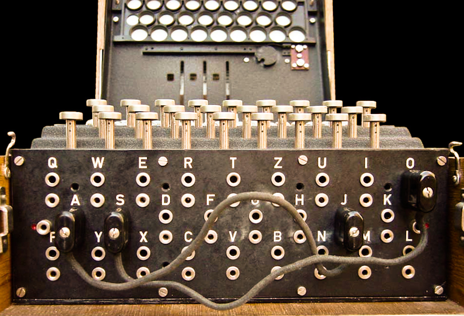
It’s possible to break symmetric encryption [2]It’s also possible to break asymmetric encryption, or any encryption, though it takes time. Perhaps one of the most famous examples is from World War II, when the Allies were struggling to crack encrypted Nazi communications. The encryption was created with a key that changed daily, and through the use of the Enigma machines. The cryptography was eventually broken, but largely through the skill of the codebreakers, poor operating practice from some of the German operators, and the capture of key tables and hardware by the Allies.
Asymmetric encryption
Asymmetric encryption, in contrast to symmetric encryption, uses a pair of keys to encrypt messages. One of the two keys is made public to everyone, and one is kept private (the two types of keys were called, cleverly enough, the public key and the private key, respectively). Messages encrypted with the public key can only be decrypted using the private key [3]Basically, the message is sent through a mathematical formula that only works one way… unless you have the incredibly complicated and unique formula that comprises the private key., which ensures that the contents of the message can’t be read by anyone except the holder of the (hopefully secure) private key. So if Alice wants to send an encrypted message to Bob, she starts by finding his public key. She then encrypts her message using that, and sends it to Bob. When Bob receives it, he uses his private key to decrypt the message. If he wants to respond, he can encrypt his reply using Alice’s public key, and the cycle continues. Since the public keys are usually published or exchanged in a way that lets each party be confident that it belongs to whomever they are sending it to, this ensures that the identity of the recipient can be verified. Alice knows that only Bob can unlock her message, and Bob knows that only Alice can unlock his.
This is commonly used on websites that are secured by SSL/TLS (including this one). Pretty much every major website is secured via SSL, and browsers will display a green padlock in the address bar of secured sites. This serves two purposes; it will prove that the website belongs to whomever it purports to belong to, and it encrypts traffic between your computer and the website so that it can’t be read by attackers, your ISP, or others who may have a vested interest in what you do.
This works in exactly the same way that the messages between Alice and Bob did. When you visit a website secured with SSL, your browser and the server exchange public keys. The server encrypts traffic to you using your public key, which your browser decrypts. And your browser encrypts traffic to the server using the server’s public key, which the server decrypts. Anyone trying to listen in on the conversation your browser and the server are having will hear nothing but random gibberish. There’s one additional thing that your browser does to ensure that it’s not talking to a fake server that’s pretending to be the real website: it takes the public key presented by the server, and it compares it to a repository of public keys. If it matches, it’s the real server. If it doesn’t, it could be an imposter– and somebody could be listening in.
So the next time you’re wandering around the web, take a minute to appreciate that little green padlock in the corner of your screen, and think about the incredibly complicated math that underpins security on the internet. It works invisibly to keep your communications safe, secure, and most importantly—private.
I’m not a cryptographer or a security specialist, just somebody who enjoys reading and learning about security. If you think I left out something important, please send me an email so I can fix it.
Basically, the message is sent through a mathematical formula that only works one way… unless you have the incredibly complicated and unique formula that comprises the private key.
Today I reconfigured a server I maintain for the Office of Residential Life and Housing. It broke yesterday because of a database issue, but I’ve taken this as an opportunity to rebuild and improve it with an included email server. I have it mostly up and running now, but it’s been a long, slow process that took far longer than I expected it to (as a sidenote, this would have been far easier if the backups I had were up-to-date. Always check your backups!)
Building an email server is more difficult than I expected. I almost expected to just run sudo apt-get install postfix and have an email server up and running; sure, it would need some configuration, but I’d be able to start sending and receiving mail almost immediately. And yes, that might be true if I installed something like Mail-in-a-Box or iRedMail, but I decided that that was too easy, jumped into the deep end, and immediately started configuring a mail server using Postfix, Dovecot, MySQL, and Spamassassin (and would have been instantly lost if it hadn’t been for this awesome guide). So I spent twelve hours copying and adapting code to my purpose, rewriting databases, adding users, restarting when I messed up.
It was absolutely awesome.
There’s something about taking the blank screen of a terminal, typing commands across it, and making something work. When you reload the page and it actually works the way you want it to, there is an immense feeling of satisfaction and accomplishment. You took something that was blank and empty, and turned it into something useful. There’s no feeling quite like it in the world.
That said, I’m totally using one of the ready-to-deploy email servers next time. Making something work is fantastic when you have the time to do that, but sometimes you just really need to have whatever you’re working on to be up and running.
I came across this article today in The New York Times written by Robert Shiller. Shiller is a Sterling Professor at Yale University who studies macroeconomics, behavioral economics, and public attitudes regarding markets, so he’s very qualified to discuss the role of stories in our economy.
The general gist of the article, as I understand it, is that stock markets are driven as much by feelings and stories than they are by data and rationality. It underscores the need to critically inspect information that you’re given– it may be rooted in truth, but it could easily be influenced by emotion. It also underscores why economic predictions can be so difficult to get right, and why economics is a social science; our assumptions are rooted in the belief that people are rational actors who carefully make the best decisions possible, even though people are famously irrational. If we’re driven by stories and emotions, it’s much harder to predict people’s actions and reactions.
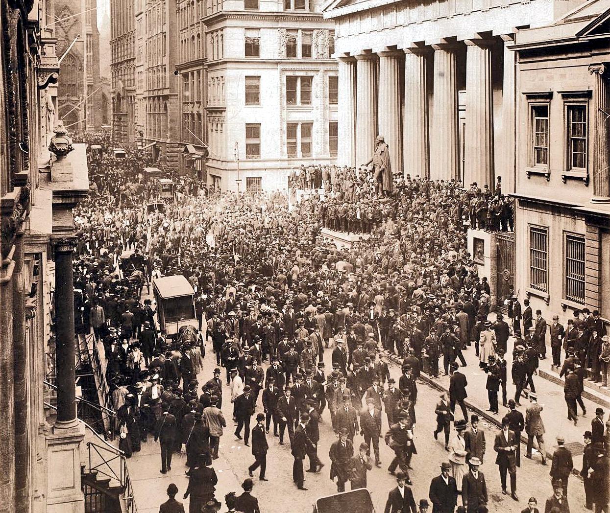
The Panic of 1907 crippled the financial markets, brought ruin to banks and trust companies, all but bankrupted the Treasury of the United States of America, and required the intervention of J.P. Morgan to end. And it directly led to the founding of the Federal Reserve System in the United States, in 1913. I was researching the crisis this past semester while taking my History of American Economic Development class at the University of Missouri — Saint Louis (I took it with Professor Rogers, and I recommend it highly). I wrote my final paper on the crisis, though I ended up relying on just two primary sources. Immediately after the semester ended I found several others that would have been very useful in my research—I’m planning to go back and revise this to include them, but I haven’t done it yet.
The events leading to the panic began on October 14th, 1907, after a wealthy investor overextended himself while attempting to corner the market in copper.
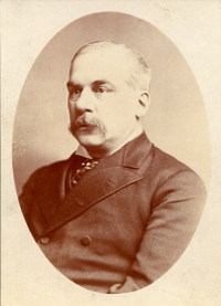
F.A. Heinze in 1904
F. A. Heinze lost more than $50 million dollars in under a day after investors realized what he was attempting, and the United Copper Company’s shares fell from $62/share to less than $15/share. (Federal Reserve Bank of Boston 3) On its own, this would have been disastrous for Heinze and other copper speculators, but would have little effect on other investors. Heinze, however, was the owner of the State Savings Bank of Butte Montana, which became insolvent almost immediately due to its holding large amounts of United Copper Company shares as collateral. Heinze was also president of the Mercantile National Bank—and once depositors learned of his financial peril, they rushed to withdraw their monies from that institution as quickly as was possible. Heinze was forced to resign his position from the Mercantile National Bank on the morning of October 17th, but the damage was done. Depositors began removing money from the Mercantile National Bank to deposit it in other banks in the area.
At this point, the panic had not yet truly begun. The financial markets were still feeling the effects of Heinze’s manipulations, and his banks were collapsing, but the overall system was still sound. And then it was discovered that one of the directors of the Mercantile National Bank, Charles Morse, controlled seven other New York banks and had been heavily involved in the copper speculation. He was removed from those banks, but depositors at those banks had already begun removing their money. (Tallman and Moen 4)
Next to fall was the trusts, starting with Knickerbocker Trust Company, the third-largest trust in New York. J.P. Morgan, widely seen as the last hope for the trust, decided to not provide aid—a decision which led to the trust paying out $8 million to its depositors during a period of three hours on October 22nd, and immediately suspending operations. Another trust, the Trust Company of America, was also hit hard and paid out $47.5 million of their $60 million of total deposits in a period of two weeks. J.P. Morgan, J.D. Rockefeller, and Secretary of the Treasury George Cortelyou deposited a combined $38 million into the trusts and banks to prop them up and allow them to continue operating. (Tallman and Moen 8)
J.P. Morgan
Meanwhile, the stock market was in trouble. Brokers regularly borrow and lend money to buy and sell shares of stock, but by October 24th that borrowable money was in extremely short supply. It was only through Morgan’s convincing the banks to loan $25 million to the stock market that the stock market was able to make it through the day; the next day was even more of a struggle, with banks being more and more unwilling to lend. In fact, banks were extremely unwilling to lend to anyone, whether it be fellow banks or to the general public, leading to a shortage of currency in the economy. To add to the difficulty, the city of New York began running out of funds, and was unable to obtain more. Morgan loaned $30 million to the city, allowing them to continue operations. (Tallman and Moen 10)
The panic eventually ended by mid-November, when Morgan convinced the trust companies and banks to support each other during runs. But the situation showed the necessity of an organization dedicated to ensuring that panics were minimized and dealt with in the best way possible; relying on a single man such as Morgan to organize the response was impractical and foolhardy.
J.P. Morgan died on March 31st, 1913, which ended any chance of his being able to repeat his 1907 actions. In December of that year, Congress voted to approve the Federal Reserve Act, which established the United States Federal Reserve. Despite the intentions of its creators, the Federal Reserve was unable to prevent the Great Depression (though I believe that that’s more because of its reliance on the gold standard, which prevented it from printing money to pay off debts and bail out banks, than of anything else. There’s some evidence for this—when the gold standard was temporarily suspended, the economy immediately began to do better).
Looking back at the 1907 Panic, it’s clear that there were few regulatory oversights. Indeed, there was little government involvement at all—J.P. Morgan basically controlled the entire response, including controlling where the money was being allocated to fight the panic, and how it was handled in the press. The Treasury did place $37.6 million in the banks to help secure them, and supplied an additional $36 million to help alleviate runs on banks, but that expended their total power (after doing that, the Treasury’s working capital had dwindled to $5 million). (Tallman and Moen 8) This would indicate that the market can self-regulate to a degree, at least when getting out of a bad situation, provided there’s someone who is well-versed in how to allocate large sums of money to get things done.
Charles Morse
It’s also clear that allowing people who own or manage banks to engage in speculation with bank money, no matter how well-founded and reliable they believe it to be, is foolhardy. If Heinze and Morse had lost their own fortunes, it wouldn’t have caused a panic. It was only when it was discovered that they were using their banks to help finance their personal speculation that the bank runs started, and the panic took off. In addition, allowing one person to outright control three banks and heavily influence four others, as in the case of Charles Morse, does not seem like a particularly good idea for anyone involved. I believe that if that were to happen today people would probably be concerned about conflict of interest and moral hazard (and for very good reason).
All in all, the Panic of 1907 could have been much, much worse. Instead of bank runs, sensational headlines, and a nice story for the economics textbooks illustrating the need for a central bank to keep everything running smoothly, it could have ended in a huge economic downturn that could have heralded in the Great Depression somewhat earlier than it did (or at least a fairly major recession; the Great Depression was a worldwide event, not something that was restricted to the United States). Instead, due largely to J.P. Morgan’s acting as a central banker and lender of last resort, it lasted scarcely a month and served mostly as a warning for the perils of an unregulated financial system.
Works cited:
Federal Reserve Bank of Boston. “Panic of 1907.” n.d. The Federal Reserve Bank of Boston.PDF.
Tallman, Ellis and Jon Moen. “Lessons from the Panic of 1907.” Economic Review (1990): 2-13. PDF.
Note about references: While originally researching this paper, I was unable to find many other quality resources regarding the panic (at least, not many that were online). If you can recommend further resources, please contact me and let me know! I would love to revise this piece to include them.
This is another adapted essay from my classes. This particular essay was my paper for my Monetary Policy class in the spring of 2015. I’ve cleaned it up a little, and adapted it for a blog format, but it is largely as it was in the spring of 2015.
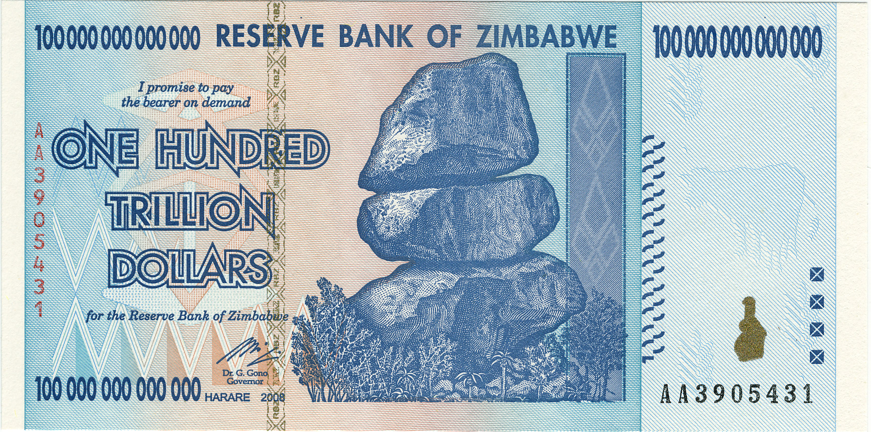
Inflation and hyperinflation is a topic that isn’t always well-understood by the general public. Those who know nothing about how inflation and hyperinflation work tend to believe that moderate inflation is good, and hyperinflation is bad—not the worst impression in the world, but also not a terribly accurate one. Fortunately for the uninformed (which included me), the author of Monetary Regimes and Inflation, Peter Bernholz, is a bona fide expert on the subject of inflation (and literally wrote the book on it).
Bernholz spends much of his book discussing what a hyperinflation is, and how it should be ended. According to him, to end a hyperinflation you must replace the hyperinflating currency with another. A hyperinflation, defined in this essay as when the monthly inflation rate goes above fifty percent, is a death-knell for a currency. Public trust in it has been eroded to the point where it is extremely unlikely that it will recover; foreign banks will refuse it; its effective value is near or at zero, and it is poisoning your economy. Replacing it with a new currency will allow Thiers’ Law to come into effect so that the new, non-hyperinflating currency can drive out the older currency and restore some order to the economy.
But how do more moderate inflations start? We know that constant inflation is a relatively recent occurrence, since, until all currencies became fiat, there was always a hard cap on how much money could be printed—namely, a certain multiple of the value of the gold a nation had on hand. Prior to fiat currency, inflation would occur in a couple of different ways. During wartimes, when convertibility was suspended, currency would often be inflated as a tax to fund the war; when a large stock of whatever backed a currency was discovered, that currency would inflate as the stock entered the money supply (which is why we don’t use leaves as currency—the ability to say that money does grow on trees would probably have deleterious effects on our economy [1]Notably, this failed completely in Douglas Adams’ The Restaurant at the End of the Universe; after adopting the leaf as a form of currency, and then suffering from massive inflation, a … Continue reading); by changing the convertibility of your currency to its commodity backing, you could change the value of your currency and cause inflation.
Milton Friedman was of the opinion that inflation is undesirable for an economy. A subscriber of the Quantity Theory of Money, he believed that Keynesian economics “[ignored] the theory and historical evidence that linked inflation to excessive growth in the money stock and depression to money shrinkage” (White 313). He supported the suspension of gold convertibility in 1971, as he hoped it would lead to tighter restrictions on the money supply, lowering inflation (White 309). He supported the 1970 appointment of his friend and mentor, Arthur Burns, as the Chairman of the Federal Reserve for the same reason (White 306). Unfortunately for him, his hopes were dashed on both counts—Burns ended up advocating for measures Friedman strongly disagreed with, and the ending of the Bretton Woods system did not end either money growth or inflation.
In fact, Nixon’s ending of the Bretton Woods gold convertibility program, which was originally established in 1944, did exactly the opposite of what Friedman wanted. Up until the convertibility was dissolved, every country had fixed the price of its currency relative to the U.S. Dollar; the dollar was the world’s reserve currency, and was exchangeable (for monetary authorities, if not the general public) for gold. When Nixon ended that convertibility in 1971, it sparked a series of inflations around the world.
To combat this and end the inflation, many countries joined the European Monetary System (which began in 1972, and continued until 1978). Known as the European “Currency Snake”, its goal was to fix the value of each currency relative to each other, and limit inflation, which it did by requiring member countries to keep the exchange rates of their different currencies within a narrow band (within ±2.25% of other member currencies) (Higgins 4). Countries were not required to remain in the Snake (France exited the Snake in 1974, re-entered in 1975, and exited again in 1976), but those countries in the Snake tended to have lower inflation rates (Germany’s inflation rate from 1973-1977 was 5.34 percent; France’s inflation rate was 10.24 percent) (Bernholz 153). Officially the Snake didn’t rely on one currency to value the others, but in practice the Deutschmark was used to value the other currencies due to the highly stable nature of the German Bundesbank (Higgins 4).
After the collapse of the Snake in 1978, the European Exchange Rate Mechanism was established in 1979 to do basically the same thing. And, functionally speaking, very little changed. The required exchange rates between countries were left unchanged, the Deutschmark was used to value other currencies, and inflation rates in member countries tended to be lower than rates in non-member countries (Higgins).
Besides pegging your currency to another, more stable currency (or to a group of other currencies), what can you do to combat moderate inflation? It turns out that moving onto a metallic-based currency works rather well. According to Bernholz, Argentina experienced a period of higher-than-desired inflation in the 1890s (Bernholz 146). After a series of bank runs, and the collapse of the Banco Nacional and the Bank of the Province of Buenos Aires in 1890, the Argentinian government halted the payment of foreign debt, reduced the number of banknotes in circulation, and ceased incurring foreign debt. The results were less than desirable for the economy; both the exchange rate and the export price index declined, and industries were hurt by the still-rising wage level (Bernholz 147). Eventually, in 1899 the Argentinian government passed a conversion law requiring the exchange of 227.27 paper pesos for 100 gold pesos. Bernholz notes that there was not enough gold to maintain this conversion rate, but that it did not matter, for the currency was still undervalued. Argentina went on a gold buying spree, and embarked on a period of high economic growth.
Switching to a metallic standard works because it forces a limit on how much money can be created by the government or central bank (if the country has one). Since little gold is introduced into the money supply each year compared to the amount of paper money that can be printed, it’s a decent way of putting the brakes on inflation and restoring trust in your economy.
Yet another way to end your inflation, according to Bernholz, is to create an independent central bank (Bernholz 157). A central bank is in a position to create and remove money from the economy; it acts as a lender of last resort, should it need to; and it can efficiently regulate the economy and the money supply (hopefully) without interference from political goals that might otherwise destabilize a currency. As we’ve seen in this class, this is often an unrealistic goal—and the appointment of Arthur Burns as Chairman of the Federal Reserve in 1970 is a very good example of why. Despite Burns’ belief in the quantity theory, as his student Friedman was, he was pressured to finance America’s war in Vietnam by printing money—which lead to massive inflation in the mid-1970s.
So is inflation good for an economy? Or does it hurt the economy more than it helps? There are very good arguments for both sides. Personally, I believe that a constant inflation is more or less a requirement for the U.S. economy as it stands today. We’re not about to cut our spending to where it can be supported by the taxes collected by the IRS, so using inflation as a tax is about the only realistic way to maintain our massive expenditures. Is this the best idea for our country? Possibly not. But, to paraphrase Bagehot’s words in Lombard Street, we must learn to deal with the system that we have, for reforming the entire system would be extremely difficult.
Anyone can find a problem with a system. Fixing that problem is much harder.
Works Cited
Bagehot, Walter. Lombard Street: A Description of the Money Market. Greenbook Publications, 2010. Print.
Bernholz, Peter. Monetary Regimes and Inflation. Northampton: Edward Elgar Publishing, Inc., 2003. Print.
Higgins, Bryon. “Was the ERM Crisis Inevitable?” October 1993. Kansas City Federal Reserve. PDF. 8 May 2015.
White, Lawrence H. The Clash of Economic Ideas. New York: Cambridge University Press, 2012. Print.
Notably, this failed completely in Douglas Adams’ The Restaurant at the End of the Universe; after adopting the leaf as a form of currency, and then suffering from massive inflation, a campaign to burn down all the forests was undertaken.
Does risk play a factor in the housing market? Obviously it does—if it didn’t, Detroit wouldn’t be in trouble right now, prices in high-crime areas would be the same as everywhere else, and we’d have subdivisions built on top of active volcanoes (at least in places other than Hawaii). But does perceived risk have an impact on housing prices? Obviously not in every case—if it happened all the time, California’s earthquake risks would result in a very empty state, or very low housing prices—but what about with something that is generally perceived by the public as unsafe, despite a pretty good safety record? For example, what about with nuclear reactors?
I chose this topic because I’ve had an interest in nuclear development and nuclear power for many years, and I already had a decent grounding in the history and background. In addition, nuclear power is often portrayed by the media and Hollywood as unsafe, despite a stellar safety record in the United States, making it an ideal candidate to see if perceived risk could influence housing prices. This was something that I’d been wondering about since starting my economics degree, so I was thrilled by the fantastic opportunity to actually research this by mapping data and analyzing the results.
I began with some basic research on whether housing prices could be affected by risk. One paper I found, Does a Property-Specific Environmental Health Risk Create a “Neighborhood” Housing Price Stigma? Arsenic in Private Well Water, written by Kevin Boyle, Nicolai Kuminoff, Congwen Zhang, Michael Devanney, and Kathleen Bell, studied the impact of arsenic in the well water of two towns in Maine. They found that housing prices had been significantly depressed after the discovery of arsenic, though the effect lasted a mere two years. They contrasted that with numerous other studies that focused on Superfund cleanup, where the effects of contamination on housing prices could lower housing prices in the surrounding areas for decades following the successful cleanup of a site (Boyle et al.).
Two other excellent papers that discussed the reduction of property values were Estimates of the Impact of Crime Rates on Property Values from Megan’s Laws (Linden and Rockoff), which discussed the effect registered sex offenders have on local property values, and Estimation of Perceived Risk and its Effects on Property Values (McCluskey and Rauser), which concludes that both media coverage and past perception of risk influence current risk perception—and that increased perception of risk lowers property prices.
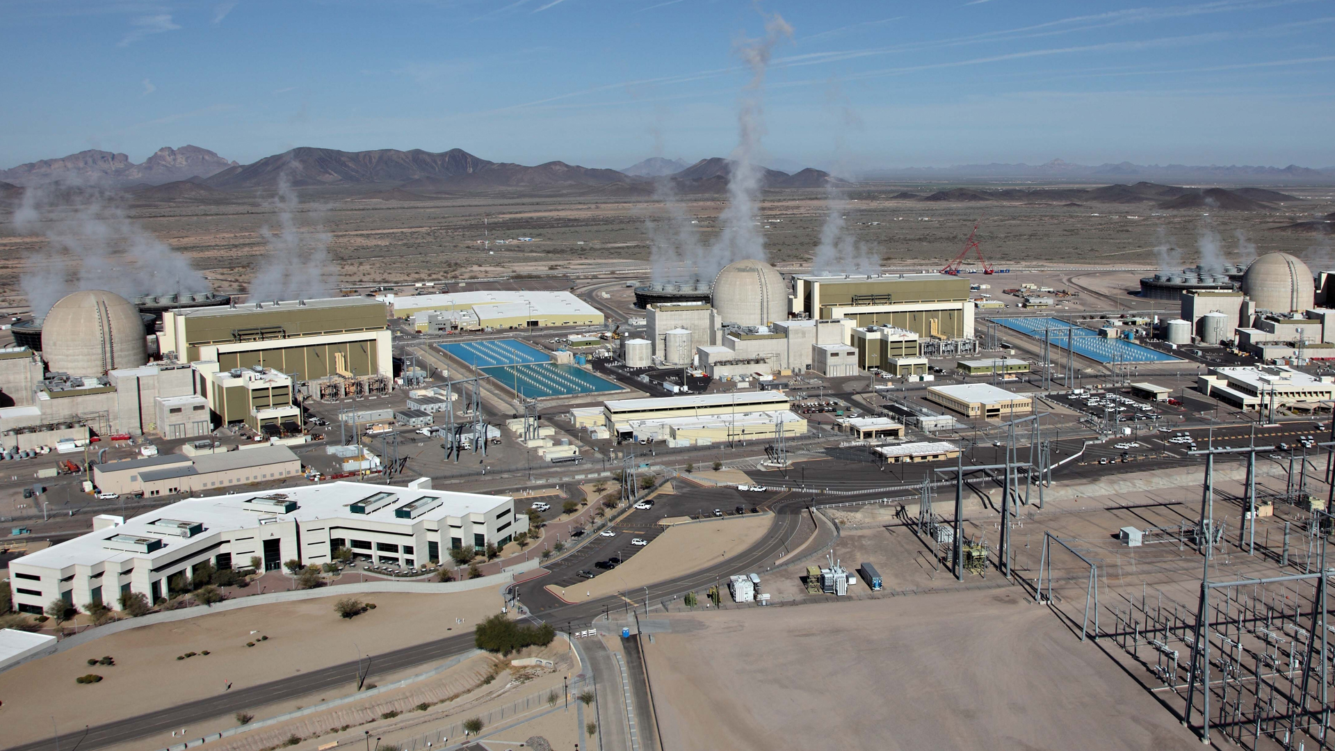
When I walked away from my research, I was far more confident in my ability to draw some conclusions based on what the data said—people were just as influenced by perceived risk as they were by actual risk. But where would I 1) be able to find a reactor in a fairly risk-free area (or at least one perceived as being risk-free), and 2) be able to find the data I would need? After doing some searching, I decided to use the Palo Verde Nuclear Generating Station, for several reasons. Firstly, because it is in a fairly stable area—the Phoenix, AZ. area isn’t prone to violent weather, flooding, earthquakes, or any other sort of natural phenomenon that might influence perceived risk (they do have some water issues, but I assumed for the sake of this project that people don’t take longer-term risks into account when deciding where to live). Phoenix is regarded by many as a generally pleasant place to live, though perhaps a touch on the warm side. Secondly, because the Palo Verde NGS[1]Unless otherwise noted, Palo Verde Nuclear Generating Station, Palo Verde NGS, and PVNGS all refer to the same thing, which is the plant. “Palo Verde”, used by itself, refers to the nearby town. is the largest nuclear generating station in the United States—if people are concerned about living next to a nuclear generating station, they’d likely be most concerned about living next door to the largest NGS in the United States. And thirdly, I chose PVNGS for a much more personal reason: I’m originally from Phoenix, and I seize any opportunity to look at anything in the Phoenix area… especially during a chilly St Louis spring.
Satellite view of Palo Verde NGS, with ten mile evacuation zone drawn around it.
I also decided to focus my research within a ten mile buffer zone of PVNGS; nuclear plants such as the one at Palo Verde are required to have a ten-mile evacuation zone around them. Within this zone, warning sirens are tested regularly, radiation monitoring is conducted, and instructions for evacuation are distributed regularly. I assumed that this ten-mile zone would be where the dangers of the generating station would be most emphasized, and therefore where the largest effects on housing prices would be.
After I figured out what I was doing and where I’d be doing my analysis, I started looking for sources of data. I’d decided to look at both housing prices, and at household income. I found that Esri’s ArcGIS Online community had both in prepackaged datasets; unfortunately, they didn’t appear to allow me to view their underlying data, which made them useless for calculating population and estimating both housing prices and household income in a particular area. Since the easiest way to get my data (using Esri to do it for me) was out, I turned to the Census Bureau. I was focusing on housing prices and on household income, so I picked the American Community Survey as the best source of data that encompassed both, and I chose to use 2011 data because the 2012 data didn’t want to import into ArcMap properly on my computer.
Coolidge, AZ is to the south of Phoenix; Palo Verde NGS is to the west.
In order to properly compare housing prices and income, I would need to have a community that was roughly comparable to the area around PVNGS, while being far enough away that it wouldn’t be influenced in any way by the nuclear plant. After looking at most of the small communities in Arizona that were between 40 and 60 miles from downtown Phoenix (Palo Verde NGS is approximately 50 miles from downtown Phoenix), I selected Coolidge, AZ., as my control community. It had roughly the same demographics, approximately the same population, and was located well away from PVNGS.
Next up was figuring out how many people lived near Palo Verde NGS, so I could double-check against the population numbers I had for Coolidge. This was originally a challenge, mostly because I wanted a fairly accurate number from what are essentially giant tracts of Census data (for the area I was in, the Census data was limited to tracts [or at least that was all I could find]). I checked to see if anyone else had had this issue before me, and I was rather surprised to learn that MSNBC investigative reporter Bill Dedman had written a very interesting analysis called Nuclear Neighbors: Population Rises Near U.S. Reactors, which included an analysis of population growth near nuclear power plants between 2000 and 2010. While the results weren’t directly applicable to my project, since the data was from a different year than what I was working with and involved different variables, a paragraph at the bottom of the article was: it noted that, because the population data was contained in census tracts, the data had been averaged based on how much of the tract was included in the buffer. A little more searching led me to instructions from Esri on how to do the same thing for the dataset I was using, and for the household income and housing prices values.
Census data around Palo Verde
Of course, this also presented a challenge in how to interpret this averaged data. Ultimately, issues with the data I had averaged led me to drop household income from my dataset—the numbers I was getting for average household income were simply too low. It’s completely possible that the average household in some areas only makes $3 per year, but Occam’s Razor would suggest that I was experiencing errors with my data instead. I had hoped that I would be able to go back, figure out my error, and obtain the correct data, but I simply didn’t have enough time to do so. This is more than a little unfortunate, because I believe that household income data is tied closely to housing prices. Leaving income out of the analysis only paints part of the picture.
This actually brings up a very important point about the rest of my analysis; while the numbers I received for housing prices are quite reasonable, and the numbers I had from Coolidge were quite close to the numbers I found on the Census website, they are estimates based on how much property is near the plant, and assumes that every tract has a single average value. A manual review of the data shows property values that are quite sane, taking into account the terrain and population of the area, but it must be remembered that they are estimates based off of estimated data (since the ACS only surveys a fraction of the residences in an area, and uses their surveys to estimate values for the entire area). Unfortunately, without GIS data from the Maricopa County Assessor’s Office (which proved too cost-prohibitive to acquire), there’s was no method I could find that would have resulted in a better estimate.
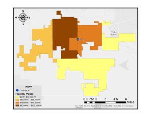
Median housing values in Coolidge, AZ.
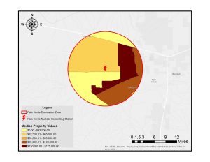
Estimated median housing values within ten miles of Palo Verde NGS
Keeping all of the above caveats in mind, along with the fact that my sample size for this survey was one nuclear power plant and one control city, I can tentatively conclude that housing prices near nuclear reactors are lower than housing prices in comparable communities. This doesn’t really surprise me—my research into the history and development of nuclear power shows that the “not in my backyard” mentality (known by the fairly catchy acronym NIMBY) is extremely pronounced when it comes to the construction and operation of nuclear reactors—though I am surprised that it was as pronounced as it is. According to my data, median housing prices around Palo Verde NGS are around $13,000 lower than the median housing prices in Coolidge– $48,232 versus $61,285. I was expecting a gap of ~$5,000, not a gap of almost three times my estimate.
And given the expansion of Phoenix in the past ten to fifteen years, I conclude that prices were originally even lower and have been artificially inflated due to housing pressures; the nearby city of Buckeye, located about fifteen miles to the west, grew from a population of 6,537 in 2000 to 50,876 in 2010—a 678.3% increase in ten years. The associated housing shortage could have easily raised housing prices in the area by a significant amount, though I don’t have the required data to estimate by how much.
Unfortunately, I wasn’t able to perform the analysis I really wanted to perform. When I set out on this project, I had intended to show that the Palo Verde Nuclear Generating Station had depressed prices in the immediate area surrounding it, which, due to limitations of my data, I was unable to prove. I had intended to use Census data from the 1970, 1980, 1990, 2000, and 2010 Decennial Censuses, but unfortunately they either didn’t record the data I needed, or they were unavailable. I tried using the historical data from NHGIS, but I was unable to make it work the way I needed it to.
So, in the absence of the data that I couldn’t obtain, how could I have expanded this to increase the accuracy of my conclusions? It probably wouldn’t have been incredibly difficult to expand this to other nuclear generating stations in the United States (and, given enough of a break from school and work, I would love to do this). If I could show that the same effect was present near other nuclear plants, it would vastly increase the plausibility of my evidence. And controlling of local risk factors would probably be fairly straightforward as long as I was careful in my choice of control community.
In addition, getting the proper household income data would paint a much clearer picture of what is going on—knowing that housing prices are lower than in another community doesn’t mean too much if you can’t show that the income level in the first community is equal to or greater than that of the second community (or at least roughly comparable). In this particular case, I needed more granular data—data I couldn’t obtain without difficulty. And, in retrospect, trying to get the income data I did have to work consumed far too much time for the payoff that resulted. If I had known that the data wouldn’t work from the beginning, it would have been far better to have instead spent that time looking at other nuclear generating stations and their surrounding communities to expand my sample size beyond a single example.
Works Cited
“2010 Census Data – 2010 Census.” United States Census Bureau. Web. 5 May 2015.
“2011 American Community Survey Data.” United States Census Bureau. Web. 4 May 2015.
Boyle, Kevin J. et al. “Does a Property-Specific Environmental Health Risk Create a ‘neighborhood’ Housing Price Stigma? Arsenic in Private Well Water.” Water Resources Research 46.3 (2010): n/a–n/a. Web. 9 May 2015.
Dedman, Bill. “Nuclear Neighbors: Population Rises near US Reactors.” Msnbc.com. 14 Apr. 2011. Web. 9 May 2015.
Linden, Leigh, and Jonah E. Rockoff. “Estimates of the Impact of Crime Risk on Property Values from Megan’s Laws.” American Economic Review. N.p., 2008. Web. 9 May 2015.
McCluskey, Jill J., and Gordon C. Rauser. “Estimates of Perceived Risk and Its Effects on Property Values.” Land Economics 77.1 (2001): 42–55. Web. 9 May 2015.
Unless otherwise noted, Palo Verde Nuclear Generating Station, Palo Verde NGS, and PVNGS all refer to the same thing, which is the plant. “Palo Verde”, used by itself, refers to the nearby town.

 O
O