Controlling and Ending Inflation

This is another adapted essay from my classes.  This particular essay was my paper for my Monetary Policy class in the spring of 2015.  I’ve cleaned it up a little, and adapted it for a blog format, but it is largely as it was in the spring of 2015.


Inflation and hyperinflation is a topic that isn’t always well-understood by the general public.  Those who know nothing about how inflation and hyperinflation work tend to believe that moderate inflation is good, and hyperinflation is bad—not the worst impression in the world, but also not a terribly accurate one.  Fortunately for the uninformed (which included me), the author of Monetary Regimes and Inflation, Peter Bernholz, is a bona fide expert on the subject of inflation (and literally wrote the book on it).

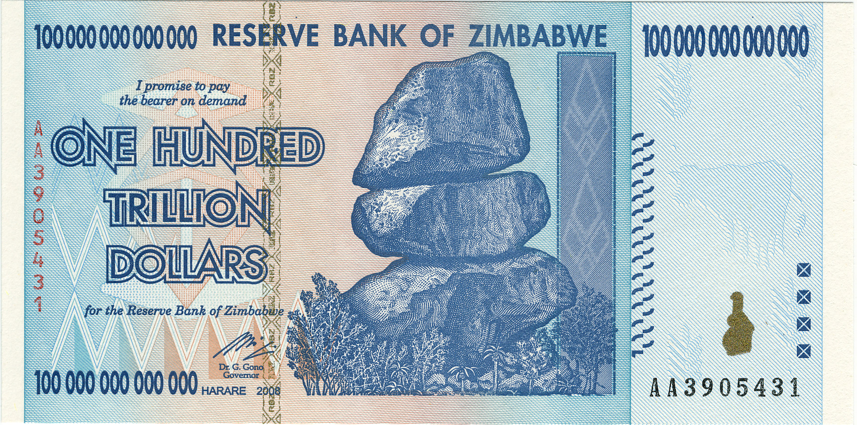
Bernholz spends much of his book discussing what a hyperinflation is, and how it should be ended.  According to him, to end a hyperinflation you must replace the hyperinflating currency with another.  A hyperinflation, defined in this essay as when the monthly inflation rate goes above fifty percent, is a death-knell for a currency.  Public trust in it has been eroded to the point where it is extremely unlikely that it will recover; foreign banks will refuse it; its effective value is near or at zero, and it is poisoning your economy.  Replacing it with a new currency will allow Thiers’ Law to come into effect so that the new, non-hyperinflating currency can drive out the older currency and restore some order to the economy.

But how do more moderate inflations start?  We know that constant inflation is a relatively recent occurrence, since, until all currencies became fiat, there was always a hard cap on how much money could be printed—namely, a certain multiple of the value of the gold a nation had on hand.  Prior to fiat currency, inflation would occur in a couple of different ways.  During wartimes, when convertibility was suspended, currency would often be inflated as a tax to fund the war; when a large stock of whatever backed a currency was discovered, that currency would inflate as the stock entered the money supply (which is why we don’t use leaves as currency—the ability to say that money does grow on trees would probably have deleterious effects on our economy [1]Notably, this failed completely in Douglas Adams’ The Restaurant at the End of the Universe; after adopting the leaf as a form of currency, and then suffering from massive inflation, a … Continue reading); by changing the convertibility of your currency to its commodity backing, you could change the value of your currency and cause inflation.

Milton Friedman was of the opinion that inflation is undesirable for an economy.  A subscriber of the Quantity Theory of Money, he believed that Keynesian economics “[ignored] the theory and historical evidence that linked inflation to excessive growth in the money stock and depression to money shrinkage” (White 313).  He supported the suspension of gold convertibility in 1971, as he hoped it would lead to tighter restrictions on the money supply, lowering inflation (White 309).  He supported the 1970 appointment of his friend and mentor, Arthur Burns, as the Chairman of the Federal Reserve for the same reason (White 306).  Unfortunately for him, his hopes were dashed on both counts—Burns ended up advocating for measures Friedman strongly disagreed with, and the ending of the Bretton Woods system did not end either money growth or inflation.

In fact, Nixon’s ending of the Bretton Woods gold convertibility program, which was originally established in 1944, did exactly the opposite of what Friedman wanted.  Up until the convertibility was dissolved, every country had fixed the price of its currency relative to the U.S. Dollar; the dollar was the world’s reserve currency, and was exchangeable (for monetary authorities, if not the general public) for gold.  When Nixon ended that convertibility in 1971, it sparked a series of inflations around the world.

To combat this and end the inflation, many countries joined the European Monetary System (which began in 1972, and continued until 1978).  Known as the European “Currency Snake”, its goal was to fix the value of each currency relative to each other, and limit inflation, which it did by requiring member countries to keep the exchange rates of their different currencies within a narrow band (within ±2.25% of other member currencies) (Higgins 4).  Countries were not required to remain in the Snake (France exited the Snake in 1974, re-entered in 1975, and exited again in 1976), but those countries in the Snake tended to have lower inflation rates (Germany’s inflation rate from 1973-1977 was 5.34 percent; France’s inflation rate was 10.24 percent) (Bernholz 153).  Officially the Snake didn’t rely on one currency to value the others, but in practice the Deutschmark was used to value the other currencies due to the highly stable nature of the German Bundesbank (Higgins 4).

After the collapse of the Snake in 1978, the European Exchange Rate Mechanism was established in 1979 to do basically the same thing.  And, functionally speaking, very little changed.  The required exchange rates between countries were left unchanged, the Deutschmark was used to value other currencies, and inflation rates in member countries tended to be lower than rates in non-member countries (Higgins).

Besides pegging your currency to another, more stable currency (or to a group of other currencies), what can you do to combat moderate inflation?  It turns out that moving onto a metallic-based currency works rather well.  According to Bernholz, Argentina experienced a period of higher-than-desired inflation in the 1890s (Bernholz 146).  After a series of bank runs, and the collapse of the Banco Nacional and the Bank of the Province of Buenos Aires in 1890, the Argentinian government halted the payment of foreign debt, reduced the number of banknotes in circulation, and ceased incurring foreign debt.  The results were less than desirable for the economy; both the exchange rate and the export price index declined, and industries were hurt by the still-rising wage level (Bernholz 147).  Eventually, in 1899 the Argentinian government passed a conversion law requiring the exchange of 227.27 paper pesos for 100 gold pesos.  Bernholz notes that there was not enough gold to maintain this conversion rate, but that it did not matter, for the currency was still undervalued.  Argentina went on a gold buying spree, and embarked on a period of high economic growth.

Switching to a metallic standard works because it forces a limit on how much money can be created by the government or central bank (if the country has one).  Since little gold is introduced into the money supply each year compared to the amount of paper money that can be printed, it’s a decent way of putting the brakes on inflation and restoring trust in your economy.

Yet another way to end your inflation, according to Bernholz, is to create an independent central bank (Bernholz 157).  A central bank is in a position to create and remove money from the economy; it acts as a lender of last resort, should it need to; and it can efficiently regulate the economy and the money supply (hopefully) without interference from political goals that might otherwise destabilize a currency.  As we’ve seen in this class, this is often an unrealistic goal—and the appointment of Arthur Burns as Chairman of the Federal Reserve in 1970 is a very good example of why.  Despite Burns’ belief in the quantity theory, as his student Friedman was, he was pressured to finance America’s war in Vietnam by printing money—which lead to massive inflation in the mid-1970s.

So is inflation good for an economy?  Or does it hurt the economy more than it helps?  There are very good arguments for both sides.  Personally, I believe that a constant inflation is more or less a requirement for the U.S. economy as it stands today.  We’re not about to cut our spending to where it can be supported by the taxes collected by the IRS, so using inflation as a tax is about the only realistic way to maintain our massive expenditures.  Is this the best idea for our country?  Possibly not.  But, to paraphrase Bagehot’s words in Lombard Street, we must learn to deal with the system that we have, for reforming the entire system would be extremely difficult.

Anyone can find a problem with a system.  Fixing that problem is much harder.


Works Cited

Bagehot, Walter. Lombard Street: A Description of the Money Market. Greenbook Publications, 2010. Print.

Bernholz, Peter. Monetary Regimes and Inflation. Northampton: Edward Elgar Publishing, Inc., 2003. Print.

Higgins, Bryon. “Was the ERM Crisis Inevitable?” October 1993. Kansas City Federal Reserve. PDF. 8 May 2015.

White, Lawrence H. The Clash of Economic Ideas. New York: Cambridge University Press, 2012. Print.


References

References
1 Notably, this failed completely in Douglas Adams’ The Restaurant at the End of the Universe; after adopting the leaf as a form of currency, and then suffering from massive inflation, a campaign to burn down all the forests was undertaken.

Do Nuclear Reactors Lower Housing Prices?

The Perceived Risk of Nuclear Power

Does risk play a factor in the housing market?  Obviously it does—if it didn’t, Detroit wouldn’t be in trouble right now, prices in high-crime areas would be the same as everywhere else, and we’d have subdivisions built on top of active volcanoes (at least in places other than Hawaii).  But does perceived risk have an impact on housing prices?  Obviously not in every case—if it happened all the time, California’s earthquake risks would result in a very empty state, or very low housing prices—but what about with something that is generally perceived by the public as unsafe, despite a pretty good safety record?  For example, what about with nuclear reactors?
I chose this topic because I’ve had an interest in nuclear development and nuclear power for many years, and I already had a decent grounding in the history and background.  In addition, nuclear power is often portrayed by the media and Hollywood as unsafe, despite a stellar safety record in the United States, making it an ideal candidate to see if perceived risk could influence housing prices.  This was something that I’d been wondering about since starting my economics degree, so I was thrilled by the fantastic opportunity to actually research this by mapping data and analyzing the results.

I began with some basic research on whether housing prices could be affected by risk.  One paper I found, Does a Property-Specific Environmental Health Risk Create a “Neighborhood” Housing Price Stigma? Arsenic in Private Well Water, written by Kevin Boyle, Nicolai Kuminoff, Congwen Zhang, Michael Devanney, and Kathleen Bell, studied the impact of arsenic in the well water of two towns in Maine.  They found that housing prices had been significantly depressed after the discovery of arsenic, though the effect lasted a mere two years.  They contrasted that with numerous other studies that focused on Superfund cleanup, where the effects of contamination on housing prices could lower housing prices in the surrounding areas for decades following the successful cleanup of a site (Boyle et al.).
Two other excellent papers that discussed the reduction of property values were Estimates of the Impact of Crime Rates on Property Values from Megan’s Laws (Linden and Rockoff), which discussed the effect registered sex offenders have on local property values, and Estimation of Perceived Risk and its Effects on Property Values (McCluskey and Rauser), which concludes that both media coverage and past perception of risk influence current risk perception—and that increased perception of risk lowers property prices.

When I walked away from my research, I was far more confident in my ability to draw some conclusions based on what the data said—people were just as influenced by perceived risk as they were by actual risk.  But where would I 1) be able to find a reactor in a fairly risk-free area (or at least one perceived as being risk-free), and 2) be able to find the data I would need?  After doing some searching, I decided to use the Palo Verde Nuclear Generating Station, for several reasons.  Firstly, because it is in a fairly stable area—the Phoenix, AZ. area isn’t prone to violent weather, flooding, earthquakes, or any other sort of natural phenomenon that might influence perceived risk (they do have some water issues, but I assumed for the sake of this project that people don’t take longer-term risks into account when deciding where to live).  Phoenix is regarded by many as a generally pleasant place to live, though perhaps a touch on the warm side.  Secondly, because the Palo Verde NGS[1]Unless otherwise noted, Palo Verde Nuclear Generating Station, Palo Verde NGS, and PVNGS all refer to the same thing, which is the plant.  “Palo Verde”, used by itself, refers to the nearby town. is the largest nuclear generating station in the United States—if people are concerned about living next to a nuclear generating station, they’d likely be most concerned about living next door to the largest NGS in the United States.  And thirdly, I chose PVNGS for a much more personal reason: I’m originally from Phoenix, and I seize any opportunity to look at anything in the Phoenix area… especially during a chilly St Louis spring.

Satellite view of Palo Verde NGS
Satellite view of Palo Verde NGS, with ten mile evacuation zone drawn around it.

I also decided to focus my research within a ten mile buffer zone of PVNGS; nuclear plants such as the one at Palo Verde are required to have a ten-mile evacuation zone around them.  Within this zone, warning sirens are tested regularly, radiation monitoring is conducted, and instructions for evacuation are distributed regularly.  I assumed that this ten-mile zone would be where the dangers of the generating station would be most emphasized, and therefore where the largest effects on housing prices would be.

After I figured out what I was doing and where I’d be doing my analysis, I started looking for sources of data.  I’d decided to look at both housing prices, and at household income.  I found that Esri’s ArcGIS Online community had both in prepackaged datasets; unfortunately, they didn’t appear to allow me to view their underlying data, which made them useless for calculating population and estimating both housing prices and household income in a particular area.  Since the easiest way to get my data (using Esri to do it for me) was out, I turned to the Census Bureau.  I was focusing on housing prices and on household income, so I picked the American Community Survey as the best source of data that encompassed both, and I chose to use 2011 data because the 2012 data didn’t want to import into ArcMap properly on my computer.

Position of Coolidge, AZ. relative to Palo Verde NGS
Coolidge, AZ is to the south of Phoenix; Palo Verde NGS is to the west.

In order to properly compare housing prices and income, I would need to have a community that was roughly comparable to the area around PVNGS, while being far enough away that it wouldn’t be influenced in any way by the nuclear plant.  After looking at most of the small communities in Arizona that were between 40 and 60 miles from downtown Phoenix (Palo Verde NGS is approximately 50 miles from downtown Phoenix), I selected Coolidge, AZ., as my control community.  It had roughly the same demographics, approximately the same population, and was located well away from PVNGS.
Next up was figuring out how many people lived near Palo Verde NGS, so I could double-check against the population numbers I had for Coolidge.  This was originally a challenge, mostly because I wanted a fairly accurate number from what are essentially giant tracts of Census data (for the area I was in, the Census data was limited to tracts [or at least that was all I could find]).  I checked to see if anyone else had had this issue before me, and I was rather surprised to learn that MSNBC investigative reporter Bill Dedman had written a very interesting analysis called Nuclear Neighbors: Population Rises Near U.S. Reactors, which included an analysis of population growth near nuclear power plants between 2000 and 2010.  While the results weren’t directly applicable to my project, since the data was from a different year than what I was working with and involved different variables, a paragraph at the bottom of the article was: it noted that, because the population data was contained in census tracts, the data had been averaged based on how much of the tract was included in the buffer.  A little more searching led me to instructions from Esri on how to do the same thing for the dataset I was using, and for the household income and housing prices values.

Census data
Census data around Palo Verde

Of course, this also presented a challenge in how to interpret this averaged data.  Ultimately, issues with the data I had averaged led me to drop household income from my dataset—the numbers I was getting for average household income were simply too low.  It’s completely possible that the average household in some areas only makes $3 per year, but Occam’s Razor would suggest that I was experiencing errors with my data instead.  I had hoped that I would be able to go back, figure out my error, and obtain the correct data, but I simply didn’t have enough time to do so.  This is more than a little unfortunate, because I believe that household income data is tied closely to housing prices.  Leaving income out of the analysis only paints part of the picture.
This actually brings up a very important point about the rest of my analysis; while the numbers I received for housing prices are quite reasonable, and the numbers I had from Coolidge were quite close to the numbers I found on the Census website, they are estimates based on how much property is near the plant, and assumes that every tract has a single average value.  A manual review of the data shows property values that are quite sane, taking into account the terrain and population of the area, but it must be remembered that they are estimates based off of estimated data (since the ACS only surveys a fraction of the residences in an area, and uses their surveys to estimate values for the entire area).  Unfortunately, without GIS data from the Maricopa County Assessor’s Office (which proved too cost-prohibitive to acquire), there’s was no method I could find that would have resulted in a better estimate.

Keeping all of the above caveats in mind, along with the fact that my sample size for this survey was one nuclear power plant and one control city, I can tentatively conclude that housing prices near nuclear reactors are lower than housing prices in comparable communities.  This doesn’t really surprise me—my research into the history and development of nuclear power shows that the “not in my backyard” mentality (known by the fairly catchy acronym NIMBY) is extremely pronounced when it comes to the construction and operation of nuclear reactors—though I am surprised that it was as pronounced as it is.  According to my data, median housing prices around Palo Verde NGS are around $13,000 lower than the median housing prices in Coolidge– $48,232 versus $61,285.  I was expecting a gap of ~$5,000, not a gap of almost three times my estimate.
And given the expansion of Phoenix in the past ten to fifteen years, I conclude that prices were originally even lower and have been artificially inflated due to housing pressures; the nearby city of Buckeye, located about fifteen miles to the west, grew from a population of 6,537 in 2000 to 50,876 in 2010—a 678.3% increase in ten years.  The associated housing shortage could have easily raised housing prices in the area by a significant amount, though I don’t have the required data to estimate by how much.

Unfortunately, I wasn’t able to perform the analysis I really wanted to perform.  When I set out on this project, I had intended to show that the Palo Verde Nuclear Generating Station had depressed prices in the immediate area surrounding it, which, due to limitations of my data, I was unable to prove.  I had intended to use Census data from the 1970, 1980, 1990, 2000, and 2010 Decennial Censuses, but unfortunately they either didn’t record the data I needed, or they were unavailable.  I tried using the historical data from NHGIS, but I was unable to make it work the way I needed it to.
So, in the absence of the data that I couldn’t obtain, how could I have expanded this to increase the accuracy of my conclusions?  It probably wouldn’t have been incredibly difficult to expand this to other nuclear generating stations in the United States (and, given enough of a break from school and work, I would love to do this).  If I could show that the same effect was present near other nuclear plants, it would vastly increase the plausibility of my evidence.  And controlling of local risk factors would probably be fairly straightforward as long as I was careful in my choice of control community.
In addition, getting the proper household income data would paint a much clearer picture of what is going on—knowing that housing prices are lower than in another community doesn’t mean too much if you can’t show that the income level in the first community is equal to or greater than that of the second community (or at least roughly comparable).  In this particular case, I needed more granular data—data I couldn’t obtain without difficulty.  And, in retrospect, trying to get the income data I did have to work consumed far too much time for the payoff that resulted.  If I had known that the data wouldn’t work from the beginning, it would have been far better to have instead spent that time looking at other nuclear generating stations and their surrounding communities to expand my sample size beyond a single example.


Works Cited

“2010 Census Data – 2010 Census.” United States Census Bureau. Web. 5 May 2015.

“2011 American Community Survey Data.” United States Census Bureau. Web. 4 May 2015.

Boyle, Kevin J. et al. “Does a Property-Specific Environmental Health Risk Create a ‘neighborhood’ Housing Price Stigma? Arsenic in Private Well Water.” Water Resources Research 46.3 (2010): n/a–n/a. Web. 9 May 2015.

Dedman, Bill. “Nuclear Neighbors: Population Rises near US Reactors.” Msnbc.com. 14 Apr. 2011. Web. 9 May 2015.

Linden, Leigh, and Jonah E. Rockoff. “Estimates of the Impact of Crime Risk on Property Values from Megan’s Laws.” American Economic Review. N.p., 2008. Web. 9 May 2015.

McCluskey, Jill J., and Gordon C. Rauser. “Estimates of Perceived Risk and Its Effects on Property Values.” Land Economics 77.1 (2001): 42–55. Web. 9 May 2015.

References

References
1 Unless otherwise noted, Palo Verde Nuclear Generating Station, Palo Verde NGS, and PVNGS all refer to the same thing, which is the plant.  “Palo Verde”, used by itself, refers to the nearby town.